My Blog
Tonalism June 18, 2022 13:21
I've been painting various landscapes as a break from doing still lifes using the Flemish technique, which got on my nerves. Trying to do fine details with worn-out brushes and essential tremor is difficult. I need to be able to rest my entire arm on the support or right near it. A mahl won't work. I decided that I would have to go without the Flemish technique and instead paint these things in watercolor with a wax finish.But I needed a break. My landscapes have never called for tons of detail, and I like painting them.
I did a couple using my long canvases (12 x 36"), which sold a print or two but are too large for me to get sales with at this point. I might turn the rest into NFTs when the market comes back up. It would be a good way to use up those canvases but still make some money from them and also get to keep the originals, which I like having around. So I will try that in a bit.
Meanwhile, because my small still life (9 x 12") sold right away, I decided to try some smaller landscapes, especially after I got totally frustrated with the mandrake still life. I have about 10 11 x 14" canvases that I forgot about, so I took one of those out. I intended to add the moon to whatever landscape I made, because me and my people love us a moon.
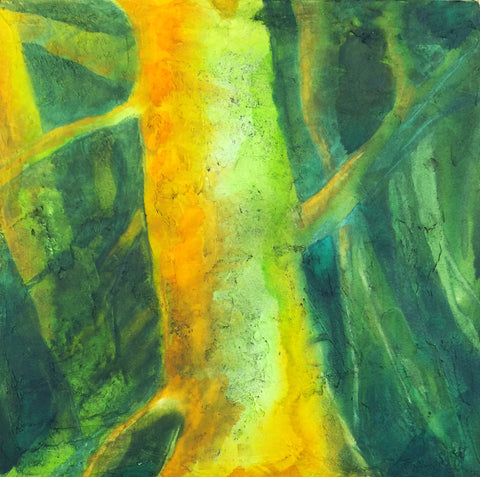
I started with a reference photo of some trees I've often photographed behind the apartment complex. I just like them as a group. I put those in against a background from another photo of a dawn in bands of gold, pink, and blue. I put the trees in with a combo of black spinel and prussian blue. I made only a few trunks and branches, and the rest was simply blotting a worn small brush around to make leaves. They came out well.
Next up, a moon, using my plastic circles thing. I knew I would touch it up again later.
Then, a group of crows flying towards the trees, and that helped me come up with a title, "Coming Home."
It was okay but to me the colors looked pretty loud after painting with a classical palette for the still lifes. And that's when I got the idea for Tonalism. I thought I might be able to create a Tonalist work simply by adding a glaze.
Some Tonalism is a little drab and depressing to me, but other Tonalist works feature the rich colors of sunset and landscapes made mysterious by darkness or mist. So I decided to try it.

So when the painting was dry, I oiled in and tried a glaze of transparent brown oxide. That made it look really dull. Too dull. I also tried making the moon brighter at that point, but it was too difficult not to mess the glaze up--nowhere to rest my shaky hand. And since the glaze wasn't really the right color anyhow, I wiped it off.
I tried again with transparent red iron oxide. That was a lot better but still too much on the dull side. So I wiped it off too.
I dug around in my red paints, of which I have a LOT. I needed something that was on the blue side of red to make the yellow more orange, the pink more pink, and the blue somewhat purple. But the quins were way too intense, the perylenes too dull, and I have a lot of scarlets.
At the bottom of the pile was a brand new tube of ultramarine pink. I opened it to see a purplish red on the dull side, and it's transparent. So I tried a glaze of that, using a very soft brush, my siccatif de courtrai, and some extra oil.
It worked. I might put another layer on when it gets dry to intensify the colors just a bit more. If I do, I will wait until that is dry and then finally lighten the moon.
I'm pretty happy with this painting so far. It really does look like a Tonalist painting, and it was quite easy and relaxing for me to do. I will make more such paintings, using different colored glazes to get different results. Really looking forward to exploring this farther.
Light Dimensional Ground on Canvas September 19, 2020 12:34

I got some of QoR's Light Dimensional Ground and applied it to a couple of 12 x 12" canvases I had sitting around. The stuff was easy to spread with a big palette knife, but I used up 2/3s of the little jar on two canvases. I don't know if I just used too much or what. I like oil paintings with a lot of texture, and I thought I might be able to capture that effect with this stuff, so I went to town. You can see the amount of texture I ended up with.
This stuff is not as smelly as the regular watercolor ground, but I still let it dry out in the hall during the day, and since we have hooligans coming into our building at night to fuck around, I took the canvases in and put them in my window to complete drying overnight. As long as it doesn't rain or freeze, I think that's going to be a good place to let stuff dry.

Today I could hardly wait to try out these supports. One technique I use a lot in watercolor is apply some paint and then mist with a hair mister to get it to run and to encourage particles of pigment to settle in the texture of the paper. I find a hair mister works many times better than a regular sprayer. You can do tiny puffs of mist just where you want them or quickly mist the whole thing to encourage granulation. I was hoping that I could do that with this ground, but I wasn't sure, since I kept reading about how it was spongy. A spongy surface might just sop up the pigment and not allow it to run. In fact, at least one review said that.
But that's not what happened with my paint. I used Daniel Smith's Green Apatite, Winsor Newtown's Prussian Blue, Daniel Smith's New Gamboge, and Winsor Orange. The apatite settled out a dark purplish brown color different from the green that dominates it. It fell into a lot of the creases and rumples and showed up as wonderful specks. It doesn't photograph well, but the photo above shows a detail.
Here's the whole painting. When you get close to the support, it does have the look of grainy paper, but the texture reminds me of acrylic, like modeling paste. The paint isn't shiny in any way. It's completely matte. I didn't feel much of a difference between this and painting on CP except that it lifts much more easily. I tried using that to my advantage to create limbs and trees in the background, but they ended up being overworked. I also tried some highlights that way, but it looked like too-vigorous lifting. So I think I might try lifting and then painting another color over the lift area, like zinc.
I'm not sure if I will add more to this. It might look better with some blue added, especially my beloved cobalt, but OTOH, I'm eager to go ahead and seal it with cold wax and see what happens. I asked the manufacturer if they thought it would be okay to use cold wax on this, because of the spongy thing. They said they didn't know but sounded kind of doubtful. That might be because no one has tried it yet.
This stuff has a lot of possibilities, but I am not sure how much I am going to use it because it is pretty expensive in terms of how far it goes. They produce it only in a small 4 oz jar. :( However, it might be possible to use Golden's molding paste and then either use watercolor on it or spread some of the regular watercolor ground over it.
However, I did just order some of Golden's Crackle Paste to try for texture as well. I didn't realize it could be used with watercolor, but on a hunch, I thought if light dimensional ground could be used that way, so might crackle paste. I can hardly wait to get my hands on it.
I am sensitive to acrylic, but I did okay with these grounds and I don't anticipate hovering over the stuff like I used to do with my paints. I will also allow the supports to dry out in the hall and/or in the window, so I think I will be okay.
I know some people might say, "Why are you trying to get texture with watercolor?" I know it's not "traditional," although in the 19th century, British watercolorists used aquapasto in their watercolors, which can produce low dimensionality with watercolors and is made from gum arabic and silica gel (that is treated in a way that makes it safe). I've used that in the past. It can give you brushstrokes similar to a not-too-heavy Impressionist style. I still need to play with that more.
But as for why insert texture into a watercolor painting, why not? There is no reason why oils and acrylics should get to have all the fun. Texture really expands watercolor and doesn't change its fundamental nature.
Lots of possibilities!
Rose Moon and Vibrating Color June 3, 2017 08:18
 In Spirit of Rose Moon, I let myself play with color a lot more. I worked hard with many layers of glazing to get a good gradation in the sky area of pale yellow to pink to blue. My efforts paid off, I think. Read more...
__________________________________________________